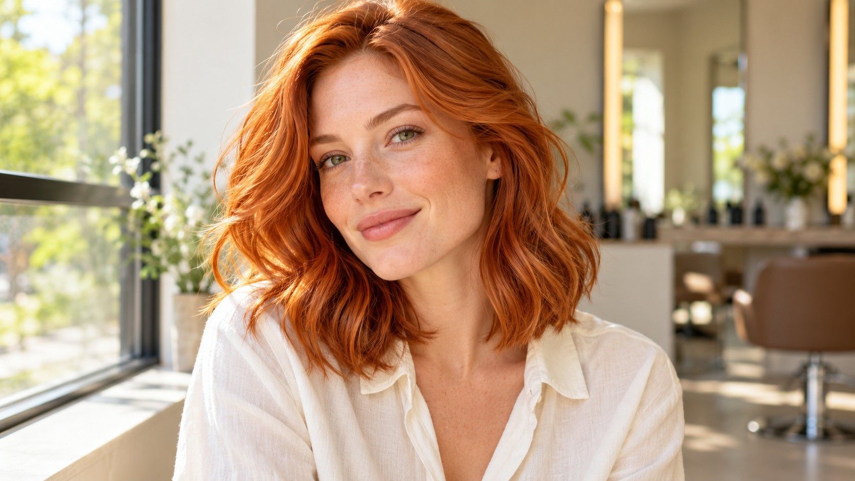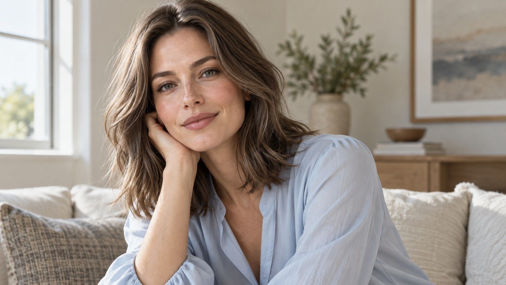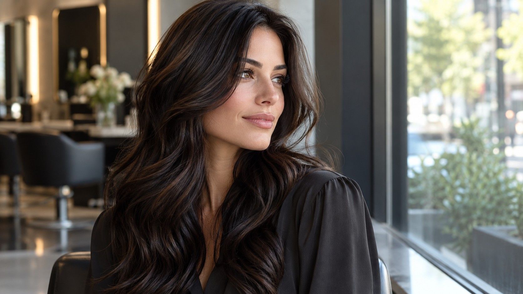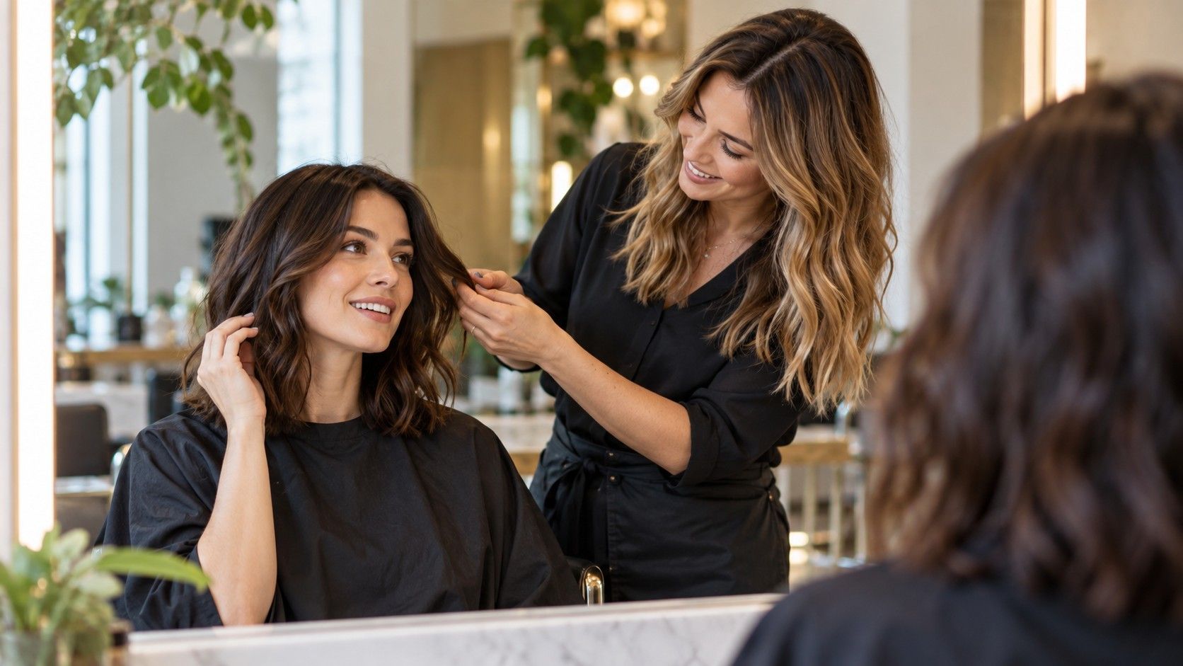
A virtual hair color try on is useful when you want to compare directions before an appointment. It is less useful as a promise of the finished color. Start with one clear photograph, keep the face unchanged and use the previews to choose a few shades worth discussing with a colorist.
Take one photograph that gives the comparison a fair start
Face a window in indirect daylight, with dry hair arranged the way you usually wear it. Keep the full hairline and as much of the length as possible in the frame. A plain background helps you spot places where an overlay spills beyond the hair. Avoid strong sunlight through a window: bright patches can make one side look lighter before any virtual color is applied.
Turn off beauty filters and portrait effects if you can. They may smooth skin, alter contrast or blur fine strands at the edge of the hair. Use your normal camera rather than a social-media filter. If your phone offers automatic enhancement, check the saved image against what you see in the mirror. You are aiming for a consistent comparison, not a flattering portrait.
Keep a copy of the original next to the edited versions. If the preview tool cannot keep exposure and skin color reasonably stable, its comparisons become harder to trust. Take a second photograph only to check the final shortlist later. Changing the starting photo for every shade introduces too many differences to tell which result you actually prefer.
Learn where the overlay ends and the real hair begins
Before comparing shades, inspect the current-color preview at the forehead, ears, parting and ends. Does it cover the hair while leaving the face and background alone? Fine curls, flyaways, pale highlights and hair crossing the cheek can be difficult for an automatic mask. A neat central section can look plausible while the edges reveal a weak selection.
Look at what happens to texture as well as color. If a preview replaces real highlights with a flat block, the result may seem heavier than a real service with dimension. If the tool adds shine or changes the apparent curl pattern, you are comparing styling effects alongside pigment. Those images may still inspire a direction, but they are a weaker basis for choosing exact depth.
A digital overlay does not test porosity, previous dye or the condition of the lengths. Very dark hair may be shown as pale blonde with a tap, yet reaching a lighter result involves a separate assessment. Keep that distinction attached to the image when you save it. I would label it “color direction” rather than “expected result.”
Compare depth first, then change the warmth
Start with three broad options: close to your current depth, somewhat lighter and somewhat darker. Keep the pose and screen brightness unchanged. View the pictures at a normal size before zooming in. Ask which version gives the face the balance you like, rather than which swatch has the most attractive name. A dramatic option can be interesting without being your first choice.
Once you prefer a depth range, compare warmth within it. Try a neutral, warmer and cooler version if the tool provides reasonably distinct choices. Avoid comparing a very dark cool brown with a pale golden blonde and attributing every difference to undertone. Depth, warmth and contrast have all changed at once in that pairing.
Watch your lips, brows and the shadows around the eyes. Does the hair dominate the image? Do you still like it with the makeup you normally wear? There is no need to prove a seasonal type from these screens. If two versions feel equally comfortable, retain both. A close digital result is a reason for a better real-world discussion, not a reason to force a winner.
Use a small comparison sheet instead of a camera roll
Save no more than a handful of serious candidates alongside the original. Give each file a practical label such as “slightly lighter neutral brown” or “dark brown, softer face frame.” Product shade names and numbers are not interchangeable between systems, and an app label may not describe a salon formula. Describe the visible direction in ordinary language.
| Saved image | Question it answers | Note to keep with it |
|---|---|---|
| Original daylight photo | What am I comparing against? | Date, current color and visible regrowth |
| Closest preferred depth | How light or dark do I want to go? | What looks better around the face |
| Alternative warmth | Do I prefer a warmer or cooler direction? | Keep depth similar for a useful comparison |
| One bolder option | Is a larger change worth discussing? | Feasibility and upkeep are still unknown |
Write one sentence beneath each candidate about why you kept it. “The hairline feels softer” is more useful than “looks good.” Include one concern as well: perhaps the ends look flat or the shade seems convincing only with a bright screen. This note prevents a favorite preview from becoming a promise you later expect a colorist to reproduce exactly.
Check the finalists away from the first screen
Revisit the comparison in an ordinary room, with the screen at a comfortable brightness. A vivid display can make a shade appear richer than you would expect in everyday light. Night modes and display color settings may alter the warmth. You do not need laboratory calibration, but changing those settings between previews makes small tone differences unreliable.
Look again the following day. Novelty often gives a dramatic color an early advantage, while a familiar shade may initially seem dull. Examine the images with a shirt color you wear often and with your usual makeup. If you want another opinion, ask a specific question such as which depth feels softer around the face; an open request for the “best” color tends to collect unrelated preferences.
Then use a second unfiltered photo in comparable daylight to check the same two or three directions. Hair placement will differ, so do not expect identical overlays. You are looking for a broad preference that survives a change of angle. If the result reverses completely, investigate the light or mask before deciding your undertone has changed.
Take the shortlist to someone who can assess the actual hair
Bring the original image, two preferred previews and a clear history of previous dye or lightening. Say which parts of each preview appeal to you: depth near the roots, warmth through the lengths or lighter pieces beside the face. A screenshot often mixes these effects together. Separating them gives the consultation a useful starting point.
Ask how close the direction is to your current base and what the process could involve. The answer depends on the actual hair, including old pigment and condition. Ask about the expected appearance as the color fades, the regrowth pattern and the care needed between appointments. A virtual preview cannot estimate those details reliably from a photograph.
For a big change, leave room for a different plan after assessment. You might keep the same depth while adjusting tone, or choose a more gradual change. That is still a successful use of the preview: it helped you identify what you wanted without treating a screen image as a formula. Keep the comparison sheet and update it with what the colorist says is realistic for your hair. You can also keep one rejected preview, clearly marked with what you disliked. A picture that feels too dark at the temples or too pale at the ends helps explain a boundary. Keep that example separate from the preferred options so there is no confusion about the intended direction. The most useful set shows your priorities clearly without overwhelming the consultation with dozens of near-identical shades.