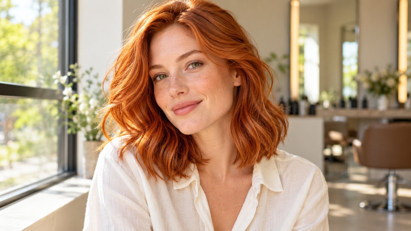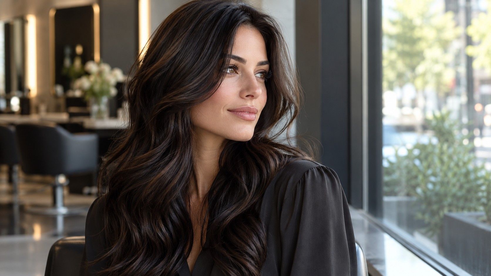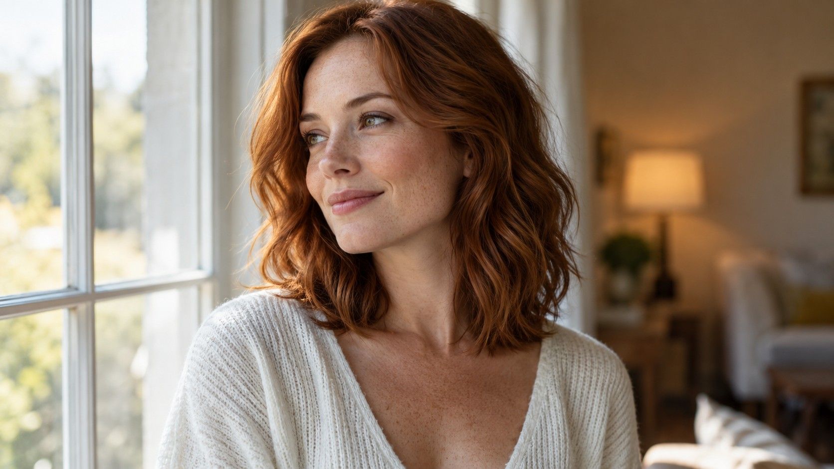
A hair color filter can look convincing at a window and strangely orange under a lamp. Before changing your choice, check what changed in the photograph. I would compare shades under one steady light first, then use a second setting to see how robust that preference is.
Check the original photo before blaming the shade
A hair color filter works with a photograph that already contains the effects of light. A warm lamp can make the original hair look more golden; a bright window can wash detail out of a forehead and the top of the head. The preview then sits on that starting image. Even when the color label stays the same, the surrounding skin, shadows and highlights can change how you read it.
Open the unedited photograph beside the result. If your skin is unusually orange in both, the filter alone is unlikely to explain the warmth. If one side of your head is a dark block in the original, be cautious about judging a deep brown there. I would correct the shooting conditions before trying to rescue the choice with another color setting. Otherwise each adjustment answers a problem created by the previous image.
Look for detail in the roots and the brightest sections. Large patches with no texture are weak evidence for a color decision. A phone may brighten a face while allowing the hair to fall into shadow, particularly against a bright background. You do not need a technically perfect portrait, but you do need enough information to distinguish your face, hairline and lengths.
Make one daylight comparison you can repeat
Stand near a window with indirect light falling towards your face. Move away from direct sun and turn off nearby lamps if they add a different tint. Keep the background simple. A pale wall is usually easier to work with than a dark room behind a bright window, although a strongly colored wall can reflect its own tint. Check your face on the screen before taking several photos.
Keep your position and camera angle steady while you capture the reference. Changing from a front view to a high angle alters how much forehead, hair and shadow you see. Then use the same original image for each filtered shade. This removes one major source of confusion: comparing a copper preview photographed at sunset with a brown preview taken on an overcast morning.
I would begin with two candidates at similar depth, then compare a lighter and darker version if necessary. Leave the screen brightness alone during this first pass. Look away briefly between images so the last bright color does not dominate the next judgment. You can explore many shades later, but an initial controlled comparison is easier to describe and remember than a gallery of twenty unrelated effects.
Understand why the bathroom and the window disagree
Indoor light and daylight can give different impressions of both hair and skin. A bathroom mirror surrounded by lamps may flatten some shadows and make a shade appear warmer or brighter. At a window, the same face can show more variation. A photograph taken under two different light sources may even have one warm side and one cooler side, which a single filter cannot meaningfully standardize.
The camera adds another interpretation. Automatic white balance and exposure respond to the scene, so changing the crop or bringing a pale shirt into the frame can alter the result. Some phones also process portraits aggressively. If your device offers a familiar way to hold exposure and focus, it can help keep a short series consistent; avoid experimenting with technical controls you do not understand just for this task.
These differences do not establish that one shade suits you and another cannot. They show that your evidence has changed. Compare each candidate under the same condition before deciding which direction you prefer. Then use a second ordinary setting as a reality check. Keep the two exercises separate: first compare the shades fairly, then see whether your preference survives a change of environment.
Use the face as a reference, without turning it into a test
Inspect the border where hair meets the forehead, cheek and neck. A deeper shade can create a stronger edge, while a lighter shade can reduce the apparent difference in depth. Neither effect is automatically better. Consider whether your eyes and eyebrows still feel connected to the whole image, and whether you enjoy the amount of contrast when you look at the portrait at its normal size.
Keep clothing and makeup consistent during a comparison. A bright lipstick or dark collar can change the balance of the picture as much as a modest shift in hair color. If your daily look varies, a second plain portrait may help. It should supplement the first image, rather than replace it only when it produces the answer you were hoping for.
An overlay cannot reliably diagnose undertone or assign a seasonal palette. Redness, tan, shadows, makeup and camera processing all complicate what you see. Use observations that describe the image: the hair appears too heavy at the temples; this blonde seems too yellow beside the face; that brown leaves a softer edge. Those are useful preferences to discuss. They do not need the authority of a supposedly definitive type.
Separate lighting shifts from a bad hair mask
Look closely at the ears, parting and ends before rejecting a color. If a filter stains the cheek or skips flyaway hairs, the odd effect comes partly from the selected area. A dark rim left around a light preview can exaggerate contrast. Curls and a busy background can make those errors easier to notice. Retake the photograph with a clearer outline if the mask is distracting.
Opacity and simulated shine also matter. Some previews let the original highlights show through strongly; others cover the whole area with a flatter layer. You may be reacting to the finish instead of the color. A glossy, evenly colored image can look appealing while saying little about how that shade would sit on your actual texture. Compare the broad depth and warmth before judging the artificial gloss.
Watch the roots in particular. A uniform digital blonde placed over dark roots does not show what real regrowth would look like, and it does not demonstrate that the lengths can be lightened safely or evenly. Keep an unedited image of your natural root color and previous dye. These are separate facts that your colorist needs, even if the preview hides them beautifully.
Check another screen only after choosing a direction
Screens can change your impression too. Brightness, viewing angle and display settings may make a saved result look warmer, cooler, darker or more vivid. Check whether a night mode or another color-altering setting is active. For the main comparison, use one screen in a reasonably lit room. A phone at maximum brightness in a dark bedroom is an awkward place to judge a subtle brown.
If you send a shortlist to someone else, include the original photograph and explain the direction you prefer. Their screen may render the shade differently. I would ask whether they understand the lighter or darker effect I mean, rather than asking them to certify an exact tone from the attachment. A screenshot is a communication aid with several layers of interpretation behind it.
A second display can reveal that a choice depends heavily on your phone settings, but it cannot supply a universal answer. Do not keep switching devices until one produces the most flattering image. If the shade looks dramatically different across screens, describe the desired quality in words and use a physical salon swatch or another suitable reference during consultation.
Turn the preview into a practical salon conversation
Save two candidates and the original image, with a short note about the lighting. Tell the colorist which feature matters: softer contrast near the face, a less golden impression, or more depth through the lengths. Mention any parts of the filter you know are artificial, such as a perfectly pale root or unusually even shine. This gives the conversation a clearer starting point than a request to copy the whole picture.
Your hair history still sets the practical questions. Previous dye, highlights, natural hair depth and condition can affect the route towards a desired result. Ask how close the proposed process might come to the reference and what uncertainty remains. A filter does not estimate the number of visits, establish a formula or replace any checks the salon considers necessary.
Finally, ask how the proposed color would grow out and how much maintenance it would require. A shade that wins in a bright window may lose its appeal if the upkeep does not fit your routine. The useful decision combines the visual preference with a workable plan. Once those agree, the preview has done its job; there is little value in chasing a digital shade that looks identical under every lamp.